Powder Room Makeover
When we bought our house 4 years ago it had been completely renovated which meant everything was fresh and white. A blank canvas. We started decorating and adding our personal touches, but still kept our neutral walls. I love the aesthetic of a crisp white home, but after 4 years I got a little bored and antsy to make some changes; our main-floor powder room seemed like the best place to start. While there was nothing *wrong* with this bathroom, there was nothing particularly right about it either. I’m of the belief that you can have fun and play around in small spaces like this. They can act as a little escape from the look of the rest of your home.
Before
So here’s where we started. A very basic grey and white bathroom. Again, nothing terrible (except that tile border in my opinion) but nothing remarkable either.
My brother is a contractor @madebymcg (yes, it really comes in handy sometimes). He gave me the honour of pulling off the tile border, and then he ripped out the basic grey tiles and replaced them with these beautiful white hexagon ones. We’ve worked together on a few renovations and he’s taught me a few tricks, so when it came time to patch, sand and prime the walls he left those jobs to me. Believe it or not, I’m pretty handy.
I knew I wanted to go big, bold and fun so I enlisted the help of my brother’s girlfriend @livingbycami. I love her whimsical aesthetic and her approach to design. She’s not afraid of colour and loves just the right amount of kitsch.
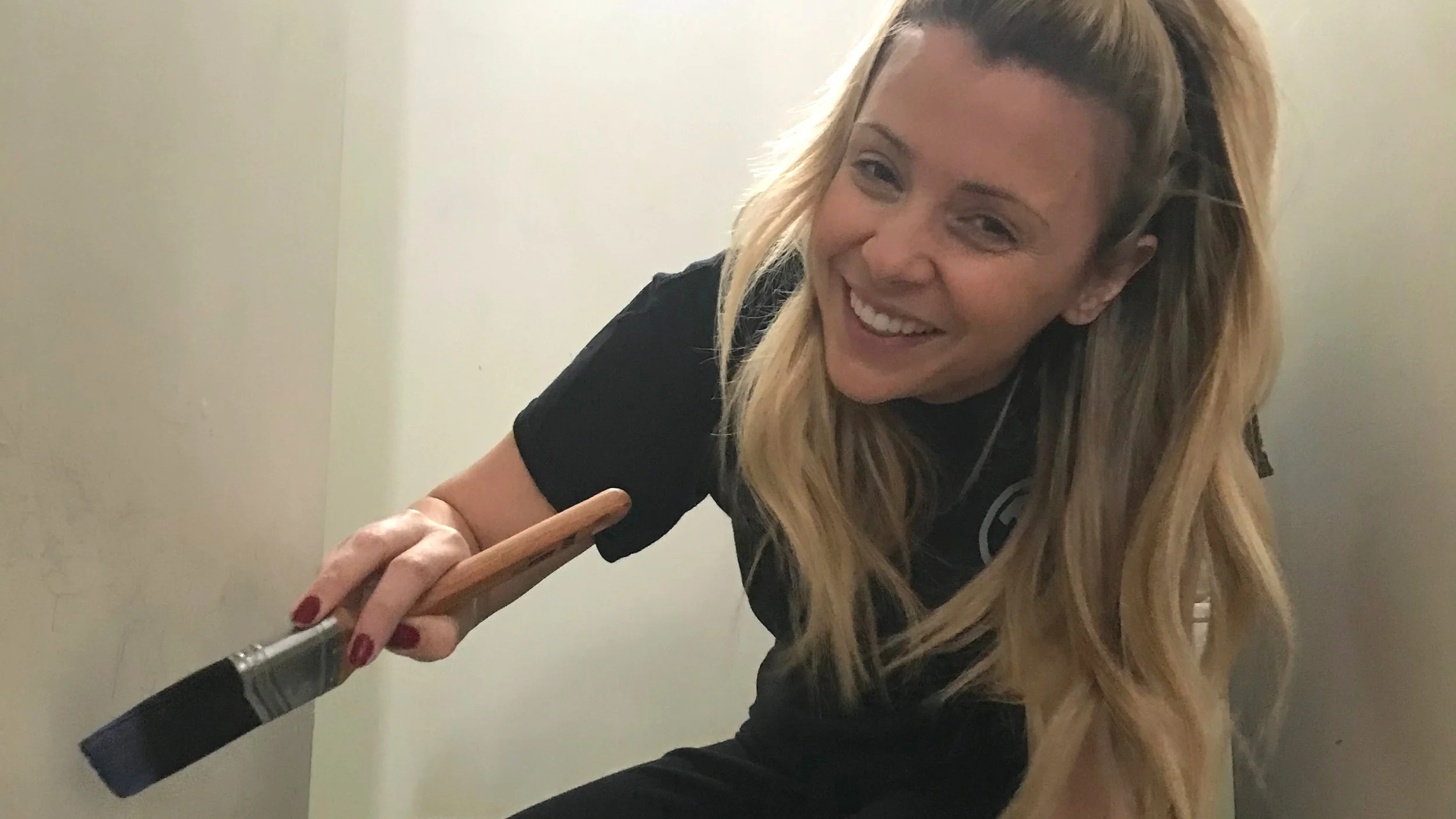
Cami and I decided we wanted a print and we wanted it to pop. We found these amazing decals from @urbanwalls and after some discussion landed on the “Vintage Florals.” We could have kept the walls neutral, but for maximum impact we decided to paint them a deep bluish-violet, a colour we picked up within the flowers. It’s called “Wizard” by Benjamin Moore and I love it. I took care of painting the walls and trim before it was time to place the decals.
Here’s where things got FUN! This is a tiny bathroom, Cami is much taller than I am and we spent about 6 hours in there together laying them out, then placing and then sticking. I highly recommend these decals. We found once we got our rhythm with the layout we were going for, the rest was simple.
We kept our original vanity and toilet, and updated the hardware including the vanity knob and toilet paper holder to brass. New mirror from Wayfair and lighting from CB2.
Just when you thought we couldn’t get any more DIY-y, we had a hard time finding a towel bar that fit this tiny little bathroom. After searching what felt like the entire internet for one that fit and was cute, we stumbled upon this blog post and used this ingenious idea.
I ordered the parts on Amazon, got a can of brass spray paint and tada!
And perhaps my favourite addition to this space is this swan faucet! Cami texted it to me and it took all of 1 minute for me to check out with it on Amazon. It’s fun kitschy and has a vintage look, which is what we were going for.
After
I love how this space turned out and I’d be lying if I said I didn’t have the itch to redesign another room in our house like, now! Randall is on board, as long as there are “no more flowers please, babe.”


